
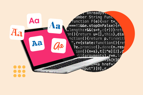
Have you ever been stuck trying to choose the perfect font for a web design project? With so many font options available, it can be overwhelming to make a decision. However, understanding the basics of font family, style, and weight can help you make better font choices that enhance your web design and grab your audience’s attention. In this blog post, we will be discussing the essential elements of font design and how to select the right font for your website.
Font Family
Font family refers to the set of fonts with similar designs but different styles. In web design, font families come in three categories: Serif, Sans-Serif, and Monospace. Serif is typically used for formal and traditional texts, while sans-serif is for modern and simple designs. Monospace, on the other hand, has equal spacing between each character and is commonly used for coding and programming. Choosing the right font family for your web design is the first step towards creating a successful design.
Font Style
Font style refers to the inherent design of a font. Different styles include bold, italic, underline, and regular. These styles can be used to create emphasis on specific texts and draw the reader’s attention. Choosing the right font style for your web design is critical because it can make the text easy or difficult to read. For instance, using a regular font style on a headline text might not attract your audience’s attention. Instead, using a bold or italic font style can make the headline more noticeable.
Font Weight
Font weight refers to how thick or thin the lines of a font appear. You can use font weight to create a hierarchy of texts in your web design. For instance, using bold for headlines, semi-bold for sub-headlines, and regular for body texts can create a clear and readable hierarchy. It’s essential to choose the right font weight for your web design because it can improve readability and make your website look more professional.
Combining Font Elements
Combining different font elements can create a unique and beautiful web design. However, it’s essential to be careful when selecting your font elements to avoid creating an unprofessional or cluttered look. One way to combine font elements is by contrasting them. For instance, pairing a serif font family for headlines with a sans-serif font family for body texts creates a beautiful contrast that makes the text more legible and visually appealing. You can also combine different font styles and weights to create a unique and visually engaging web design.
Choosing the right font for your website
Choosing the right font for your website can be challenging, but it’s not impossible. When selecting a font, consider your website’s purpose, target audience, and style. Keep it simple, unique, and visually engaging. Always remember to check your font’s readability and legibility on different screen sizes and devices.
Conclusion
In conclusion, understanding the basics of font family, style, and weight is critical in selecting the right font for your web design project. Choosing the right font can improve your website’s readability, professionalism, and appeal to your audience. When combining different font elements, create contrast, simplicity, and uniqueness. Keep in mind your website’s purpose, target audience, and style when selecting a font. With these tips in mind, you will create a beautiful, engaging, and professional web design.